SurveyMonkey Web System
In 2016, I pitched some ideas for a brand new web system for our internal web building experience. Unlike the previous system that was made of hundreds of different components, I wanted to try a system with one component that can accommodate hundreds of styles.
ROLEUX Designer
PROJECT TYPEWeb page builder overhaul
DELIVERABLESWordpress based web system
BACKGROUNDWe’ve recently gone through a rebrand of SurveyMonkey and needed to update our website. We soon found out that whenever designers needed something edited, however minor, had to go through engineering. Everything was extremely inefficient so I pitched for building a new web system, that would provide designers full suit of options that can be used to create new pages and provide quick design edits.
Full web design audit
We started with a full web design audit and took notes of the current webpage building experience. At the time, our system had such limited flexibility, that we needed engineers to build something new even for a very minor edit.
Wordpress based system
We landed on creating a Wordpress based system. It was the easiest to learn for web page builders who were not very tech savvy, yet it provided enough power for designers and engineers to achieve some impressive feats.
Push design as far as possible
Our goal was to push design as far as possible. We wanted a page building system that provided freedom for designers. We didn’t want to turn to our engineers every time designers wanted to try something new.
Built for maximum flexibility
Unlike most web frame builds, where webpages are made of many different rows that does one specific thing, I wanted to create a flexible system where designers can build different layouts and functions directly in wordpress without any further use of engineering resources.
Size and spacing flexibility
The system allows manual control of sizings, spacing, and layering such as:
Ability to manually input max-width.
Ability to manually input column and column ratio
Ability to manually input margin space left, right, top and bottom (negative spacings included).
Can select to erase selected columns or row based on breakpoints.
Above are manual input options, typically, the system follows a default grid system with consistent spacing and column selections.
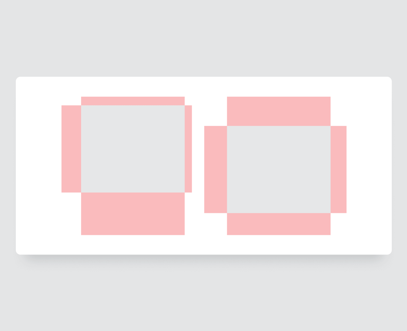
Box inside each columns
Inside each columns, there is another surrounding box with it’s own set of rules.
Separate manual controls for max width and spacing.
Separate Manual size and spacing controls for mobile breakpoints.

Image within text box options
Images and SVGs can be selected “On” for text boxes. It has the option to live at the top, bottom, and left. Alignment is adjustable. Size is defined by the images themselves.

Box options
Objects such as text or images live inside another box. This box has the ability to manually select both height and width.
Within the box, user can select different alignments horizontally, and vertically.
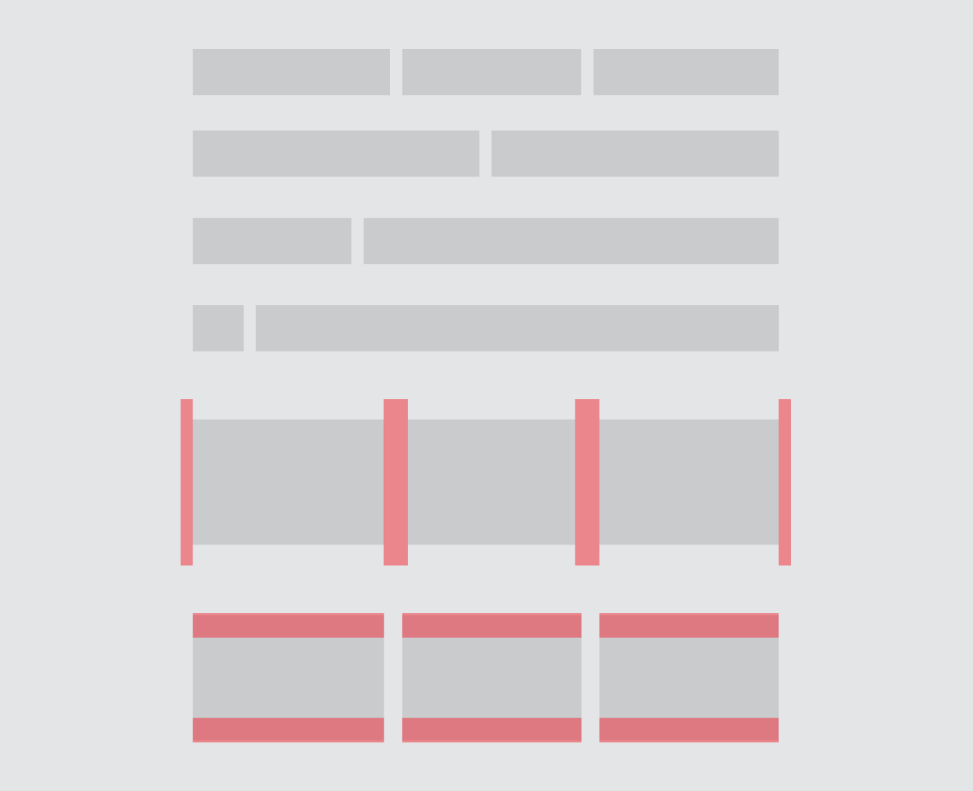
Layout flexibility example
The Flexibility options above allows one to use a single component to have all of these layout options:

Row imagery options
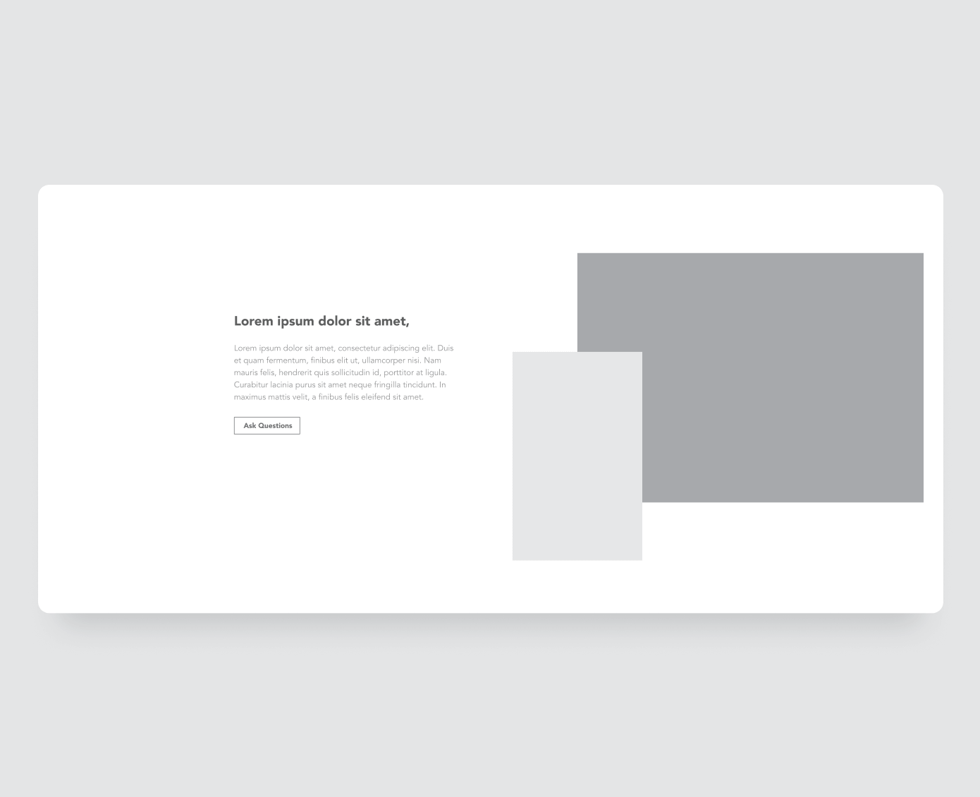
Image positioning - horizontal
Most of the times, images should fit flush with the standard grid. However, we have the ability to have the image peek outside the frame to either sides depending on the size of the image.

Image positioning - vertical
We also have the ability to have the image peek outside top and bottom of the frame.
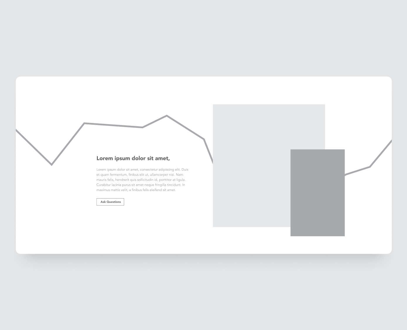
Layered images
We have the ability to place background images in SVG, animated SVG, video, and images format.
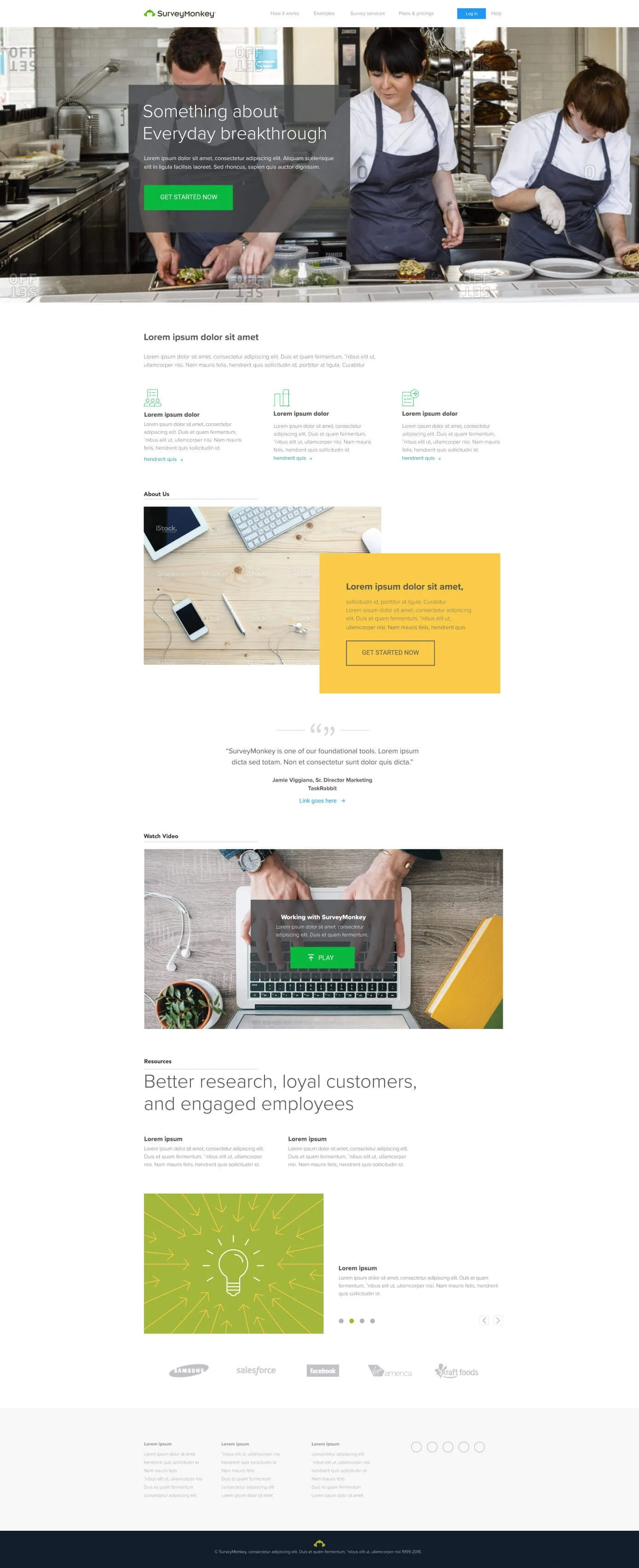
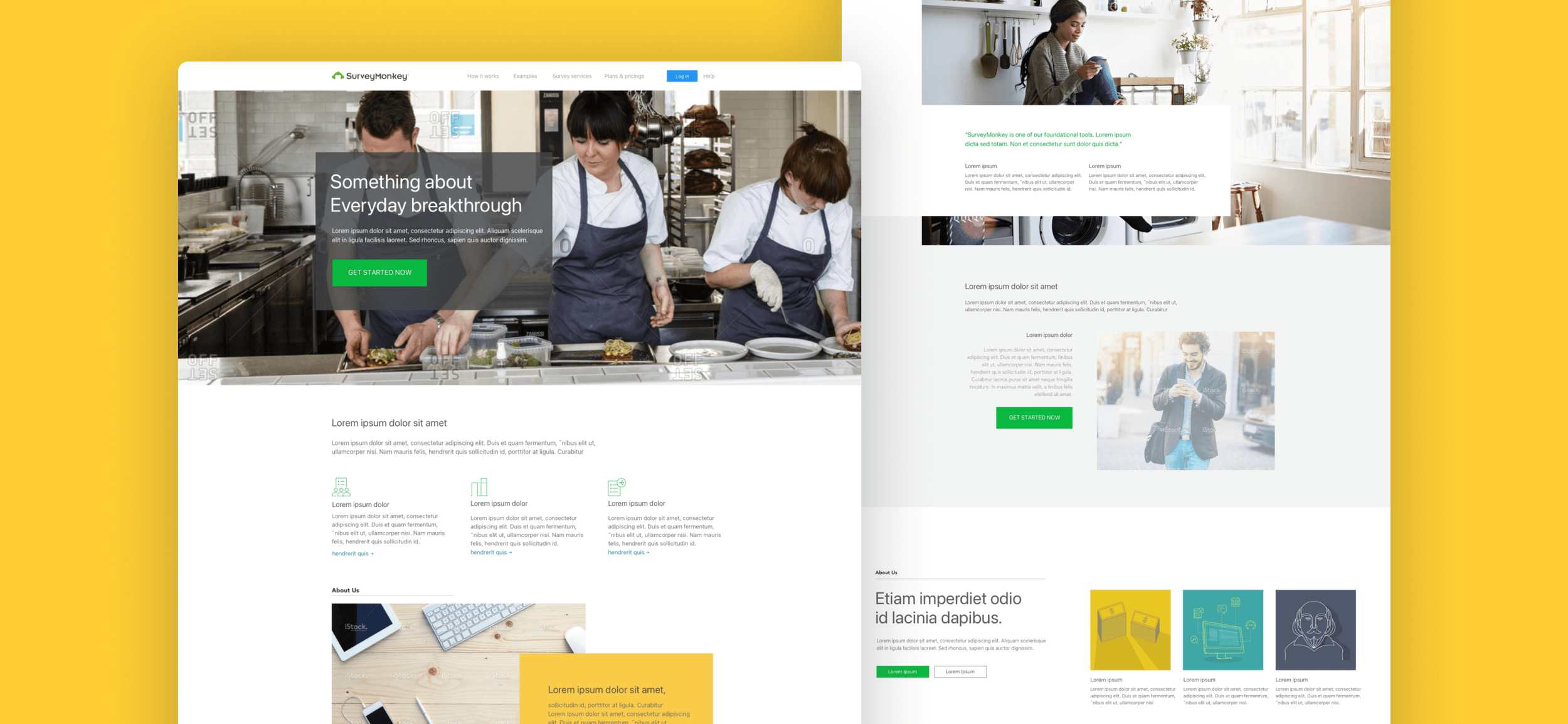
Sample designs made from the options