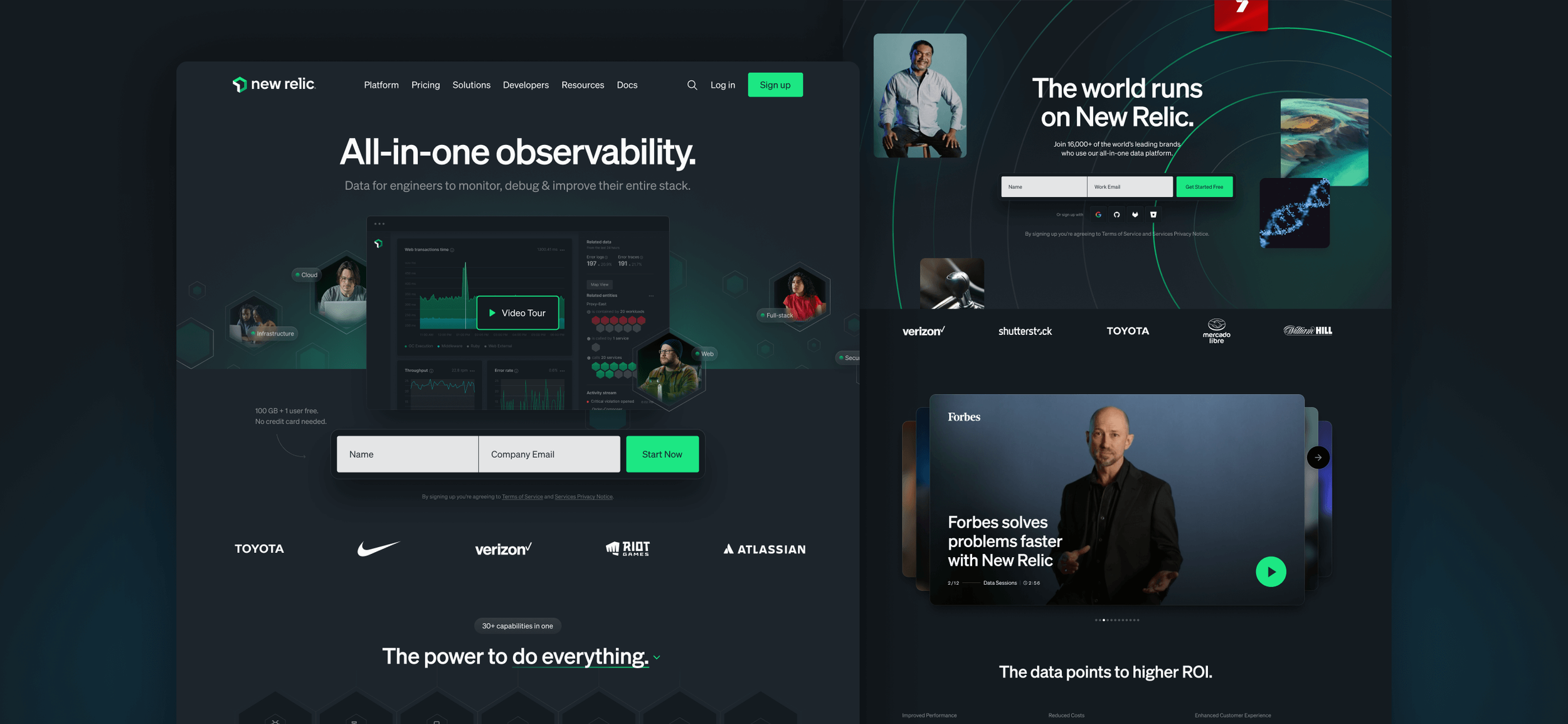
New Relic
ROLESenior UX/UI Designer
PROJECT TYPESaas / Web Experience
TEAM3 Designers
5 Developers
1 Content writer
2 Project Managers
BACKGROUNDWith the new Brand Guideline finally in place, the web design team was tasked to update the entire web experience. We had a team of 3 designers, and each of us handled both UX and UI. For some projects such as the homepage, we worked on the wireframe together, then divide up our parts by sections. Since I had engineering experiences, I was also tasked with working directly with our engineering team to for quality control.
WORK DETAILSWork closely with our marketing partners and identify areas of weakness in our current web system, and come up with content strategy.
Work closely with our engineering team and ensure sure all new components in the design library functional yet flexible and customizable enough for various use cases.
Continue to push designs forward while updating our web-brand system that would eventually elevate our websites.
How do I create a system that is robust and easily manipulated by non engineers / designers while providing enough flexibility for experiments and growth? How should we expand the capabilities of each component to save engineering resource?
CHALLENGEComponent Library
Besides the basic patterns such as typography, grid systems, and color, our web design system was organized by “components” created in Figma. “Component,” in this case, represent row of designed elements in a given page. Parameters for creating these components were:
Based on overall strategy
Overall messaging, information architecture, content order, and greater web UX strategy defines which component to be used per page. All componets in the library must have a purposeful use case that is based on our business objectives.
Flexible use cases
If possible, each component should be designed in a way that it can be used for multiple use cases. When designing the components, think about how the same UX pattern can create impact for other web pages with different business goals.
Create with growth in mind
Most of the times, the components should follow the basic pattern rules. However, during the process of designing new components, we should evaluate if expanding our basic pattern is worth it to create bigger impact for our web UX.
Updating the Figma library
I was in charge of organizing the Figma Library. The library was updated to catalog components by page types. The library included all our basic web design guidelines, brand guidelines, and component use cases.
Creating the components
To save engineering and marketing resources, we identified 3 cases where we can create a new component:
Component that creates biggest impact in a page that needs to be impactful.
Component that creates value through flexibility, where a single component can bring value by serving multiple business objectives.
Component that brings impact with innovative features.
EXAMPLE 1Capabilities Component
Create maximum impact in a pages that should drive the most business value.

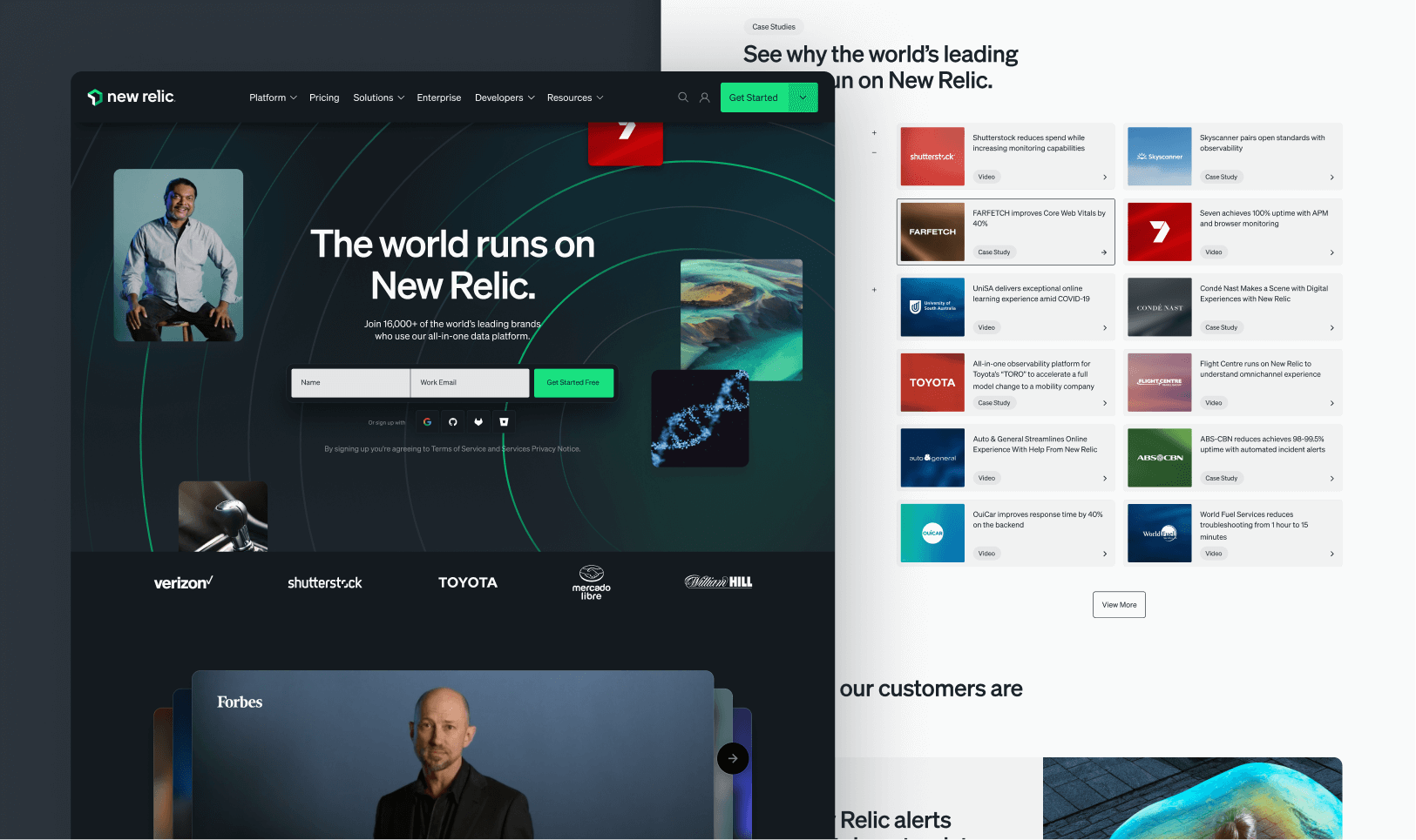
PROBLEMAfter rounds of figuring out the content strategy with our stakeholders, we found that the homepage will become very long if we were to follow the strategy one to one. To raise our page performance and still communicate to our customers according to our strategy, we needed a single component that combined three ideas:
We offer over 30 capabilities: We needed to show our customers that New Relic offers comprehensive solution that is capability rich, ready for any type of use case.
Connected solution: We needed to communicate that our tools allow workflow that eliminates silos within engineering teams and data.
Details for each use case: We needed a way to show our customers that the products we offer are relevant to actual engineering work. We needed to show that with New Relic, engineers can monitor, debug, and improve their entire stack.
Overall process
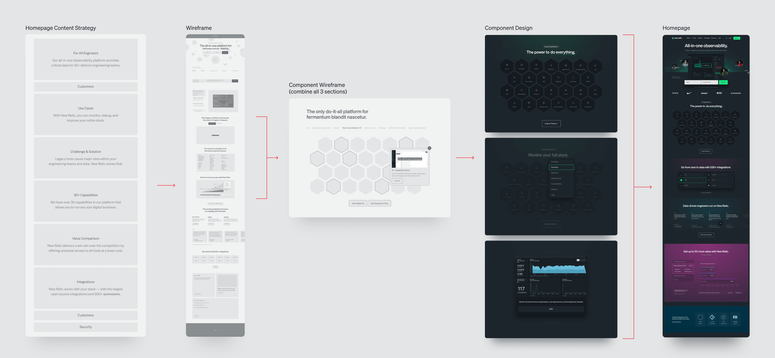
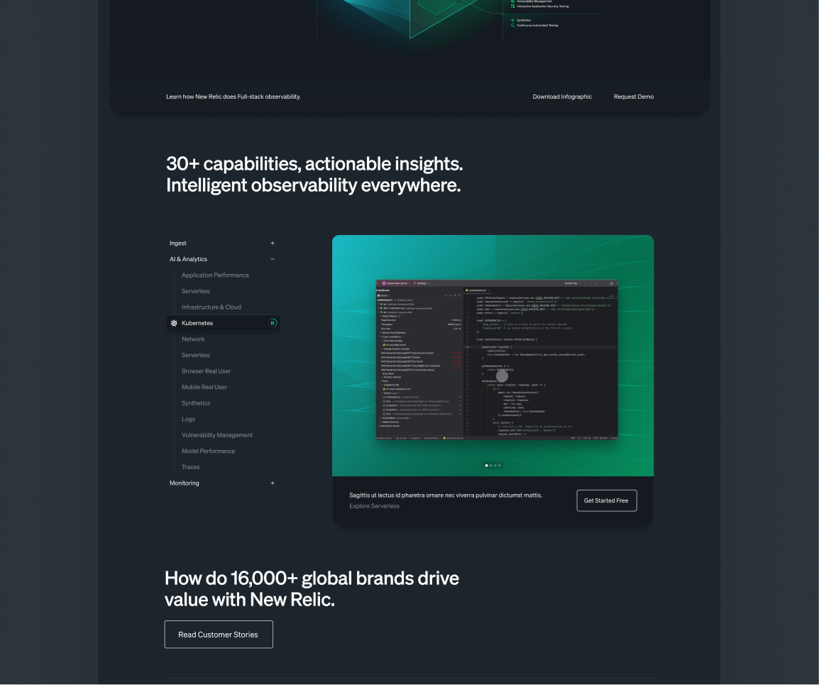
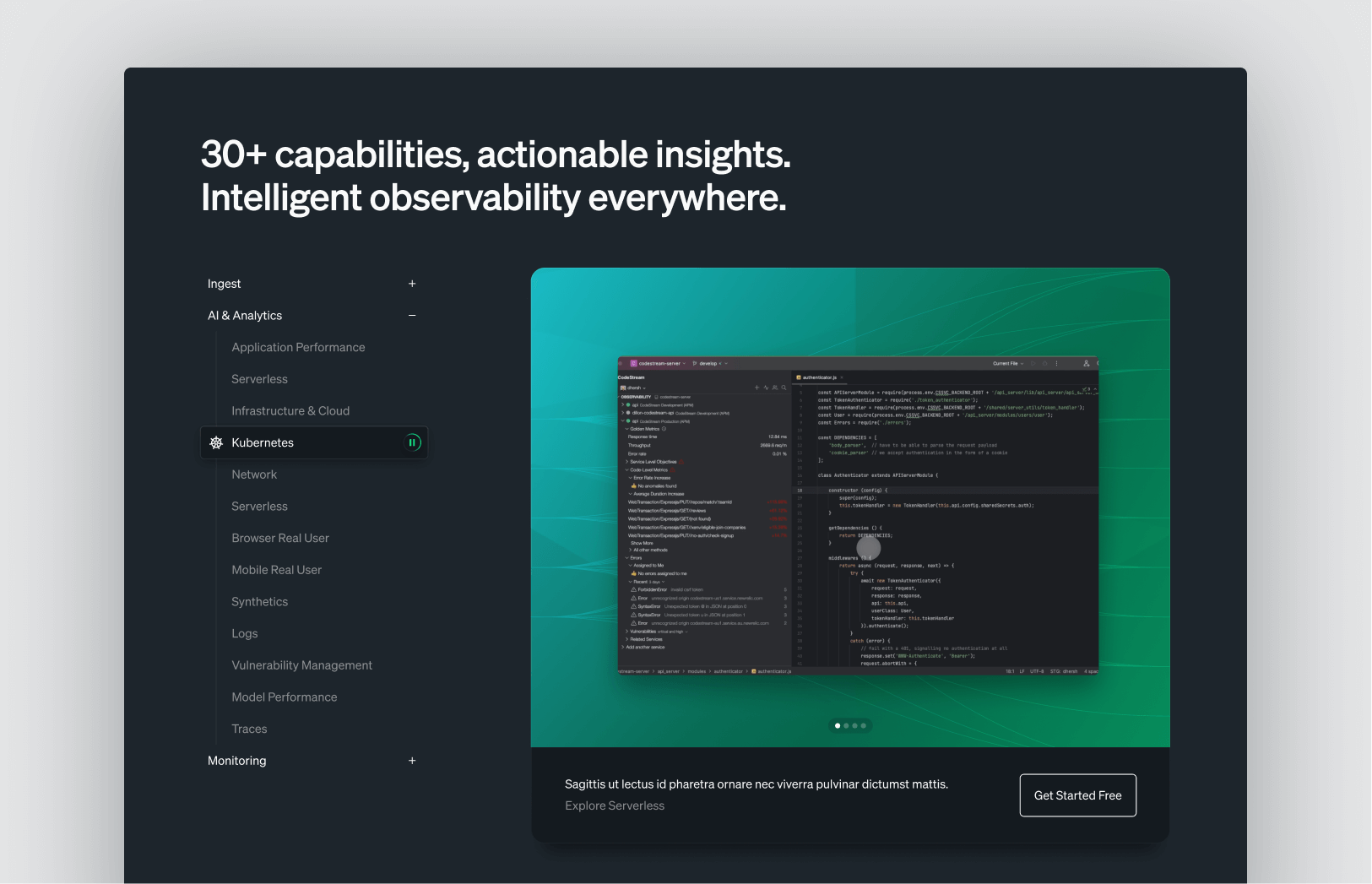
Component features

Featuring 30+ capabilities
Initial view of the component display large collection of capabilities we feature. To limit the height, of the component, it is limited to 26. The component has a CTA that guides the user to explore all platform.

Exploring the capabilities
Hero content is also a filtering element where the capabilities are organized by types of customers that uses New Relic.

Filtered view
Once filter is applied, user can see which capabilities apply to them. They can also explore other use cases and see which capabilities overlap. Also, all features are available and visible for all customers, thus eliminating silos.

Details for each use case
When a capability box is clicked, customers can see demo video, brief description, and a CTA button that guides the user to a dedicated page about to the capability.
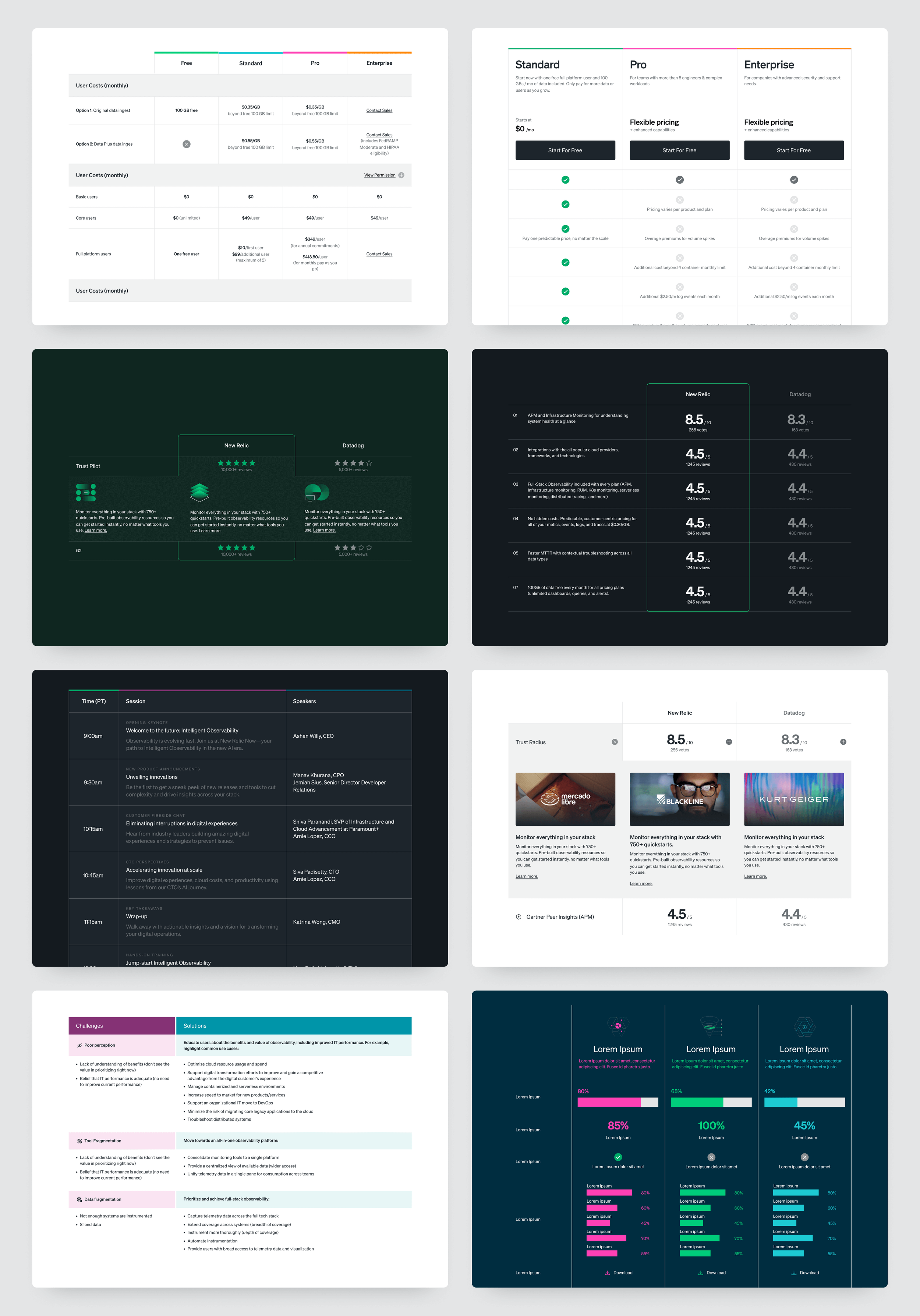
EXAMPLE 2Table Component
Create value through flexibility,

PROBLEMDuring webpage audit, we found that we had 5 different table types spread throughout the website. Tables were being used over 10 webpages, most of them categorized as high impact pages. At the time, all our tables were custom made with HTML and CSS. We desperately needed to create a table component that can accommodate all 5 types of tables, make it easy to create or edit within Drupal backend, and easy for the users to process information quickly in the frontend. The table types were as follows:
Company comparison table: Table that compares New Relic vs other companies, and features statistics and ratings.
Offerings comparison table: Table that compares between different New Relic offerings. It features more details about each offering.
Pricing comparison table: Table that compares pricing and different features per pricing.
Detailed table: Mostly used in case studies, where the content could be pretty much about anything. It uses icons, different color schemes to categorize things, and sometimes even charts and graphs.
Event agenda table: Table used for events. It features time and date, session information, and speakers.
How can we create a single, easy to execute table component that can accommodate so much variety of content?
CHALLENGEBreaking down the tables
Instead of looking at tables in terms of use cases, I thought we should just start with setting up rules around the format of all the tables. To see which areas should be flexible and which areas should be a fixed feature.

Table size
Columns start from 2 to maximum of 5. If content requires more than 5 columns, break up the content so that it uses more than one table.
Row could go longer, but if more than 15 rows, apply “View more” CTA button

Header and sub-header row
These should be on/off feature in case we do not need to use them.
This section should have the ability to add CTA and extra content.
This section should have the ability to have icons and different color patterns.

Label column
Label column can display extra features such as numbers, time, icons,
Label column items should also have areas to display extra content.

Body cells option 1
Each cell has the ability to have different text sizings and colors
Each cell has the ability to add svg, jpg, and png images.
Left, center, and right alignment available
Text link and CTA button can be added

Body cells option 2
Full color options
SVG, jpg, png images can be added to each cell
Charts and graphs are SVG
Link with icon options added

Body cells option 3
Tooltip option added for extra content.
Tooltips are limited to maximum 2 sentences, and there is no link.

Body cells option 4
In case of bigger content expansion, dropdown option is added to add more content per cell.
Alignment can be edited to line up with the cells above.

Body cells option 5
Content expansion is in it own editor system in Drupal. This allows content to have different layout, image options, and link and CTA options.
Using the table component
All the table options listed above are based on the UX design audit on the tables used at New Relic. Depending on the mix and matching of the options, our new table component allows all kinds of table formats. Here are some examples showing the power of the new component:
EXAMPLE 3Navigation
Create impact through innovative features.

PROBLEMOne of the first things to improve while working to update our website was the navigation. The new information architecture has already been worked on before I joined the team, so I was tasked to create an applicable UI design. Problems in the nav that I encountered during the study were:
Users feeling lost: With over 50 product capabilities listed in one menu, customers found the navigation absolutely overwhelming.
Lack of direction: Nav was disorganized overall and needed a clear direction for users (engineers and business decision makers) to find relevant information quickly.
Growing pains: Continuous experiments with information architecture meant that we needed a nav system that can be customized, changed, and grow over time.
Opportunity to improve web performance: I thought it would be a good idea to add a personalization feature to the navigation, and looked to which areas might provide the highest impact.
Navigation features

Two click process for “Platform” nav
With a growing list of capabilities (around 30 when I joined the company, 50+ currently), we needed a system that reduces cognitive load for our users, and have it be more scaleable over time.
I changed the “Platform” area into a two click process, where the left rail is a primary nav that features bigger categories, and the right side features the actual list of capabilities within the category.

Cleaner UI and Personalization
Turned the rail idea into a pattern so that we can feature different information in the rail than the main body.
The rail items are made to be personalized based on the user.

Personalized CTA
Main CTA is transformed into two click process. Second CTA step appears in overlay and displays different type of information based on the user.
Highlights
Above only show few of works I’ve done at New Relic. There are just too many to show them all, but here are some highlights covering my stay at New Relic.
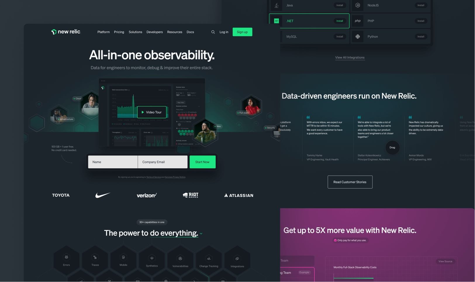
Over 70 webpages
Worked on over 70 webpages, each of them applied with consistent process covering from content strategy, wireframing, UI design, and engineering follow ups.
Over 5 websites
Worked on over 5 websites, and created 2 micro-sites from scratch. Created and provided UX guidelines, UX strategy, UI Design, and expanded Drupal capabilities.
Over 15 new components
Over 15 components with each component integrating corporate messaging, Drupal application, UX for both customers and web authors, and engineering follow ups.